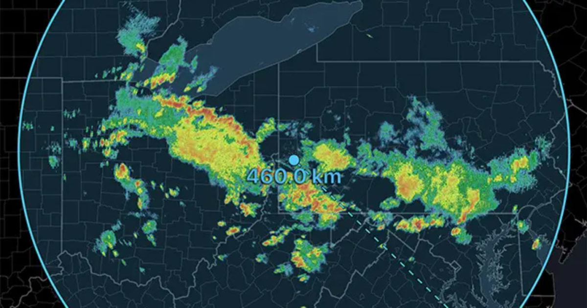
During weather events, millions of people take to social-media platforms, such as Twitter and Facebook, to post and read about the adverse weather around them. From PhD meteorologists to middle-school aged weather enthusiasts, many users of social-media are posting screenshots of weather radar, and a large percentage of these screenshots are from RadarScope. We love seeing our app used as a catalyst for scientific exploration, public safety, and decision making!
A frequent feature request we get from our core customer base is the ability to have customizable color tables in RadarScope. As a scientist, I understand wanting to customize the data visualization just to your liking. However, this practice is not socially responsible. Recent research into public perceptions and decision making during severe weather has shown the public at large finds interpreting radar images difficult. The research also shows the most effective way to motivate someone to take action during severe weather is by showing them live streams of the actual phenomena; a tornado on the ground, rushing flood waters, snow covered roads, etc. However, during weather events, a broadcaster might not have access to live video or, perhaps, a weather enthusiast might wish to join the discussion. In these cases, we often fall back to the penultimate weather remote sensing technology; radar.
As RadarScope is the most used app by anyone with a smartphone (or Mac) to display and share real-time weather radar data, our team has a social responsibility to help provide a consistent message. The last thing we want is for someone under threat to be discerning all of the different radar color tables on their Twitter feed. The RadarScope team is firmly committed to providing a consistent experience to not only our customers, but customers of our customers. Considering our commitment to consistency and safety, we are choosing not to expose a custom color table option in the app at this time. However, the underlying codebase uses an industry standard color table format making implementation of customization easy in the future, should we find the right circumstances and feel comfortable making this an option.

Looking back at the horrific, unforgettable afternoon of May 20, 2013, we would never want a resident of Moore or southern Oklahoma City seeing multiple, yet different, visualizations of the same data. Given RadarScope is a large component of providing a consistent message, the app will continue, for now, to use color tables matching (or very close to) those utilized by the National Weather Service’s Warning Decision Training Division. By doing this, every instance of RadarScope you use and every screenshot share on social-media will always consistently visualize threats.